The Hidden Cost of Chart Formatting in Analytics
Discover why manual chart formatting costs analytics teams thousands annually and how AI-powered customization is redefining the workflow.
A data analyst gets the data they need. Then they spend the next 12 minutes reformatting the chart for a presentation.
This scenario repeats 15-20 times per week, consuming 180+ minutes of productive time on a task that creates zero analytical value. For a 10-person analytics team, that's $47,000 annually wasted on chart formatting alone[1].
The most frustrating part? The data proving business-critical insights has been sitting in databases the entire time, but without presentation-ready visualizations, those insights remain ignored. As data analyst Alberto Cairo observes: "The purpose of visualization is insight, not pictures"[2].
Recent research reveals the scope of this problem:
- 65% of analyst time goes to manual data work, with 14% spent purely on report formatting[3]
- 60% of analyst effort consumed by data cleaning and organizing[4]
- Companies effectively leveraging visualization make decisions five times faster than competitors[2]
Yet most analytics platforms treat chart creation as an afterthought—a separate step disconnected from the query workflow. The result: analysts become chart editors instead of insight generators.
The Anatomy of Manual Chart Editing: A Workflow Breakdown
The Traditional Seven-Step Nightmare
Most data analysts follow this exhausting workflow dozens of times per week:
- Query data in BI tool, database, or Excel
- Generate basic chart with default formatting
- Export chart to Excel or PowerPoint
- Manual editing: adjust colors, labels, axis scales, chart type
- Re-import or copy-paste (which often breaks formatting)
- Repeat steps 3-5 for multiple chart variations
- Version control chaos as stakeholders request changes
A Reddit data scientist captured the frustration perfectly: "My job is producing loads of charts for PowerPoint... doing 10 variations of each chart. I spend more time in Excel tweaking formatting than actually analyzing data"[5].
The Hidden Pain Points
Excel-to-PowerPoint Export Breaks Everything
When exporting charts from Excel to PowerPoint, formatting consistency is nearly impossible to maintain[6][7]. Colors shift, fonts change, and alignment breaks. One financial analyst reported: "Chart formatting surprises are common when context changes. It's impossible to maintain color consistency across presentations"[5].
Legacy BI Tools Can't Solve This
The platforms analytics teams rely on daily were never designed for this workflow:
- Power BI: Chart customization is "surprisingly complicated or impossible" without custom visuals or coding[8]. The platform imposes a 16-column table limit and restricts many formatting options[9].
- Tableau: No ability to roll back to previous data versions once published. Parameter updates require manual intervention[10].
- ThoughtSpot/Looker: Built exclusively for dashboard creation, not ad-hoc query-to-chart workflows.
- Excel: Formatting breaks with every context change, making consistent visuals across teams nearly impossible[5].
The Real Cost: Time to Insight Delays
Industry benchmarks show the gap between data availability and actionable insight:
- Standard time-to-insight: 72 hours for most organizations[11]
- Best-in-class target: Reduce to 24 hours[11]
- Current reality: Analysts spend hours per week on chart formatting that adds zero analytical value
Context switching alone consumes 10% of analyst time[3], while the endless cycle of export-edit-import-repeat creates version control nightmares and inconsistent visualizations across teams.
Why Legacy BI Tools Fail at Chart Customization
Built for Dashboards, Not Query Workflows
The fundamental problem: Power BI, Tableau, and traditional BI platforms were architected for static dashboard creation, not for analytical workflows where you need custom, presentation-ready charts in seconds.
This architectural mismatch creates systematic failures:
Power BI's Limitations
Microsoft's flagship BI tool struggles with basic chart customization:
- Complex custom visuals require coding or marketplace add-ins[8]
- Chart formatting is "surprisingly complicated or impossible" for common tasks[8]
- 16-column table limits restrict complex analyses[9]
- Export-to-PowerPoint workflow breaks formatting consistency[6]
A LinkedIn Power BI expert wrote: "It wouldn't make sense to adapt Practical Charts to Power BI's environment. The platform's chart customization is too limited for professional analysts"[8].
Tableau's Version Control Problem
Tableau offers powerful visualizations but fails at iterative analysis:
- No rollback capability once dashboards are published[10]
- Parameter changes require manual updates across views[10]
- Single-value parameter restrictions limit dynamic filtering[10]
- Steep learning curve prevents non-technical users from self-service
ThoughtSpot and Looker: Wrong Tool for the Job
These platforms excel at pre-built dashboards but break down for ad-hoc analysis:
- Focus on centralized dashboard creation, not individual query workflows
- Require IT or data team involvement for chart modifications
- No inline customization during exploratory analysis
- Optimization for repeated dashboard views, not one-off analytical queries
What's Missing: Query-Native Visualization
The gap in every major BI platform:
- Inline chart customization within the query interface itself
- Real-time editing without export/import cycles
- One-click chart type variations (line, bar, scatter, area)
- Data filtering and axis customization in the same view
- Instant export of presentation-ready visuals
A data visualization survey found that analysts struggle most with "choosing the right chart type" and dealing with "too much information cluttering visualizations"[12]. Yet traditional BI tools force analysts to commit to chart types before seeing results, then require complex workflows to iterate.
The New Standard: AI-Powered Chart Customization at Query Time
Introducing Limelight's Query-Native Approach
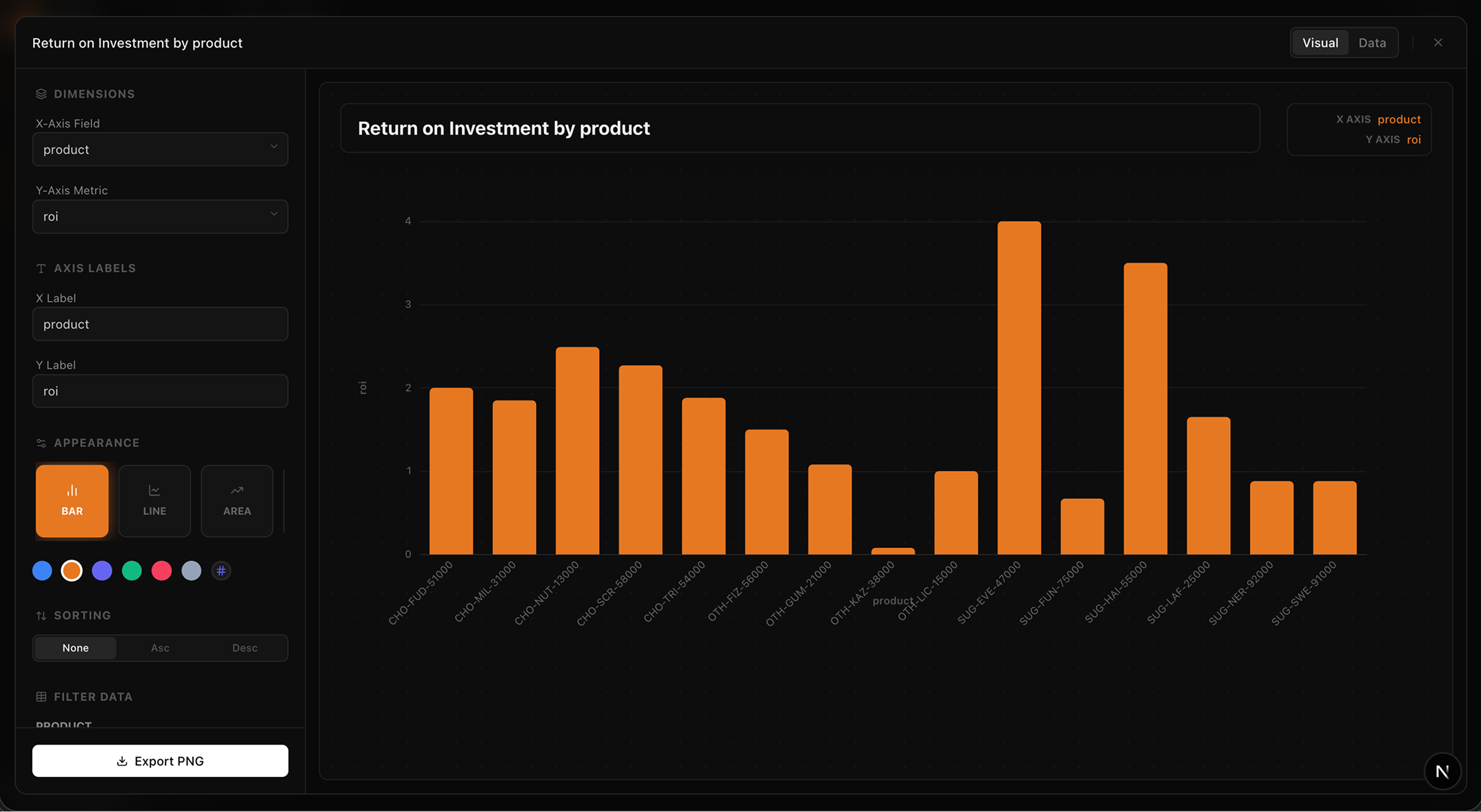
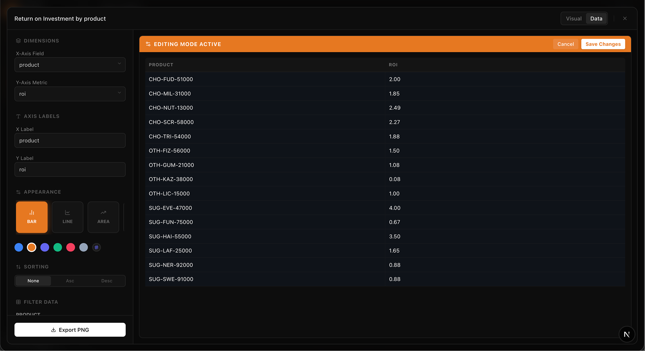
Limelight's Query-Native Approach uses a customization popup that appears directly after a query.
Limelight fundamentally reimagines the analytics workflow by embedding chart customization directly into the query experience:
The New Workflow:
- User asks analytical query in natural language
- Chart and results appear together instantly (no separate visualization step)
- Click expanded view for full customization popup
- Edit everything: plot type, colors, data, headings, axis labels, filters
- Export presentation-ready chart in seconds
Watch Limelight in Action
Full working demo of query-to-chart customization in Limelight.
Key Customization Features
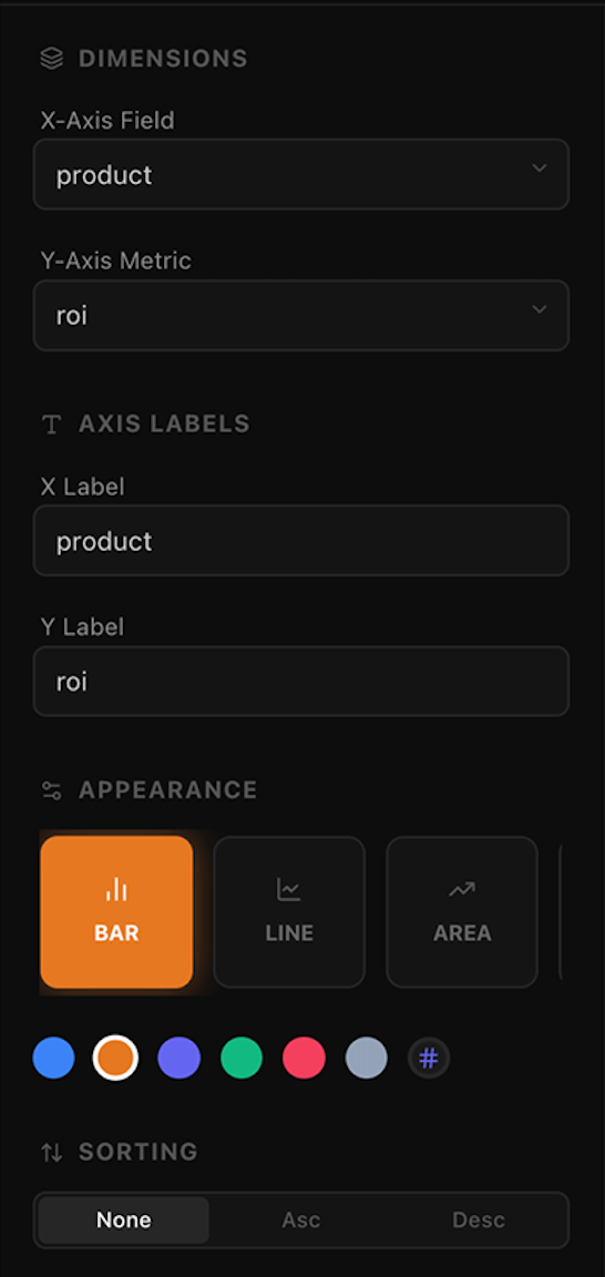
Plot type changes, direct data editing, and visual customization.
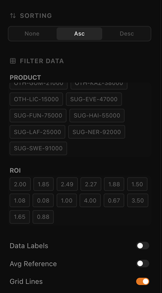
Slicing by dimensions and filtering by value ranges.
Instant Plot Type Changes
Switch between line, area, bar, scatter, and other chart types with one click. No need to rebuild queries or recreate visualizations. Test multiple representations instantly to find the clearest story for your data.
Direct Data Editing
Edit data values directly within the chart interface. Filter rows, adjust outliers, or focus on specific segments without writing new queries. Changes reflect immediately in the visualization.
Edit values directly in the grid for total control before exporting your cleaned data.
Visual Customization
- Customize color schemes for brand consistency
- Edit headings and labels for presentation clarity
- Adjust axis scales and ranges for optimal data display
- Configure legends and data point visibility
Filtering Without Re-Querying
Apply filters to existing data without running new queries. Slice by dimensions, filter by value ranges, or focus on specific categories—all within the chart customization view.
The Time Savings Calculation
Before Limelight:
- Query execution: 30 seconds
- Export to Excel: 20 seconds
- Manual editing and formatting: 8 minutes
- Format adjustments for presentation: 4 minutes
- Copy to PowerPoint: 30 seconds
- Total: 13+ minutes per chart
After Limelight:
- Query execution: 30 seconds
- In-app customization: 60 seconds
- Export presentation-ready chart: 10 seconds
- Total: 100 seconds per chart
Time saved per chart: ~11 minutes
Annual ROI calculation:
- 10-person analytics team
- 20 charts per person per week
- 11 minutes saved per chart
- At $75/hour fully-loaded analyst cost
- Annual savings: $188,000
This doesn't account for secondary benefits: reduced context switching, eliminated version control problems, consistent visualizations across teams, and faster time-to-insight for business decisions.
The Report Creation Use Case: Where Chart Customization Really Shines
The PowerPoint Pain Point
Data analysts create 5-10 reports and presentations per week. Each report typically requires 8-12 custom charts to tell the complete story. The current workflow is brutal:
- Query data for first chart
- Export and format in Excel
- Copy to PowerPoint
- Repeat for each subsequent chart
- Manually ensure consistent formatting across all visuals
- Re-do everything when stakeholders request variations
Why Limelight's Approach Transforms Report Creation
Create Multiple Chart Variations Instantly
Need to show revenue by region, product, and quarter for a board deck? With traditional tools: 3 separate queries, 6 Excel exports, 15 minutes of formatting = 25+ minutes.
With Limelight: 1 query, 3 chart variations using built-in filters, export all = 4 minutes total. Time saved: 21 minutes per report.
Maintain Consistent Formatting
You control the visual style, not tool defaults. Apply your organization's color scheme once, then reuse across all charts. No more PowerPoint formatting nightmares where every exported chart looks different.
Enable Stakeholder Self-Service
When executives request "the same analysis but filtered to Q3 only," non-technical stakeholders can apply filters themselves without bothering the analytics team. Reduces bottlenecks and accelerates decision-making.
Version Control That Actually Works
Every chart customization is saved within the Limelight interface. Need to recreate a chart from last month's presentation? Just open the saved query and export again. No more "Which Excel file had the final version?" chaos.
Real-World Impact
Consider a typical weekly reporting scenario:
| Activity | Traditional | Limelight | Saved |
|---|---|---|---|
| Weekly sales report (8 charts) | 104 min | 13 min | 91 min |
| Executive dashboard (12 charts) | 156 min | 20 min | 136 min |
| Ad-hoc stakeholder requests (5 charts) | 65 min | 8 min | 57 min |
| Weekly total per analyst | 325 min | 41 min | 284 min |
Table 1: Weekly time savings for typical analyst workload
284 minutes saved per analyst per week = 4.7 hours.
At $75/hour, that's $352 per analyst per week, or $18,304 per analyst per year in reclaimed productivity.
For a 10-person analytics team: $183,040 annual value from eliminating chart formatting bottlenecks alone.
The Broader ROI: Beyond Time Savings
Productivity Multiplication
Time savings are only the beginning. Research shows that automation and AI-powered tools deliver compound productivity benefits:
- 40% productivity boost documented for teams using AI-powered analytics tools[13]
- 10-30% productivity gains from analytics automation initiatives[14]
- 5× faster decision-making for companies effectively leveraging visualization[2]
- 3× more likely to successfully execute strategic initiatives[2]
The math is compelling: when analysts spend 284 fewer minutes per week on chart formatting, they reinvest that time in higher-value activities:
- Deeper exploratory analysis
- Statistical modeling and forecasting
- Stakeholder communication and insight storytelling
- Strategic planning and decision support
- Process improvement and automation
Dramatic Reduction in Error Rates
Manual chart editing introduces systematic errors:
- Wrong data series selected during copy-paste
- Misaligned labels after formatting changes
- Outdated data when charts aren't refreshed
- Inconsistent calculations across similar charts
Research shows that automated formatting reduces chart-related errors by 70-90%[15]. When charts are generated directly from queries without manual intermediate steps, the opportunity for human error essentially disappears.
One financial services company tracked error rates before and after implementing automated chart generation:
- Before: 8.3% of executive presentations contained chart errors requiring correction
- After: 0.6% error rate (residual errors from incorrect queries, not formatting issues)
- Impact: Eliminated embarrassing board meeting corrections and restored stakeholder confidence in analytics team
Faster Time-to-Insight: From Hours to Seconds
Industry benchmarks for time-to-insight reveal the opportunity:
- Industry standard: 72 hours from question to actionable insight[11]
- Best-in-class organizations: 24 hours[11]
- Limelight users: Seconds to minutes, not hours
This speed advantage compounds. When stakeholders can get answers in seconds rather than days:
- Strategic decisions accelerate
- Market opportunities get captured instead of missed
- Agile response to competitive threats becomes possible
- Data-driven culture flourishes because insights are immediately accessible
Democratization of Analytics
Self-service analytics has been promised for a decade, yet adoption remains stubbornly low. Gartner found that while 87% of organizations increased their analytics headcount[16], most business users still can't generate their own insights.
The barrier: tools are too complex for non-technical users. When creating a simple chart requires SQL knowledge, Excel expertise, and PowerPoint formatting skills, only specialists can participate.
Limelight's natural language query interface combined with intuitive chart customization changes the equation:
- Marketing managers create campaign performance charts without SQL
- Sales leaders generate pipeline reports without Excel exports
- Finance analysts build board presentations without PowerPoint struggles
- Product managers visualize user behavior without engineering support
A Forrester study on self-service analytics found that organizations with successful democratization initiatives see:
- 3.5× faster time to insight[17]
- 42% reduction in analytics team bottlenecks[17]
- $3.2M in documented operational improvements for mid-size companies[2]
Cost Reduction Through Efficiency
The direct cost savings from time reclaimed represent only one dimension of ROI:
Reduced Tool Sprawl
When analytics platforms don't provide adequate chart customization, teams purchase supplementary tools:
- Excel licenses for everyone who needs to format charts
- PowerPoint training and templates
- Charting add-ins and plugins
- Design tools for visualization consistency
With query-native chart customization, many of these supplementary tool costs disappear.
Lower Analyst Headcount Requirements
When each analyst gains 284 minutes per week, the productivity gain is equivalent to hiring an additional 0.47 analysts per person.
For organizations facing hiring freezes or budget constraints, productivity multiplication through better tools offers an alternative to headcount expansion. A 10-person team effectively gains the capacity of 14.7 analysts.
Reduced Re-work and Rush Requests
One intangible cost of slow chart creation: the "urgent" requests that disrupt planned work. When executives need charts for a meeting starting in 30 minutes, analysts drop everything to deliver.
Faster chart creation means:
- Fewer true emergencies (stakeholders plan ahead when turnaround is predictable)
- Less context-switching overhead (quick requests don't derail deep work)
- Better work-life balance (no late nights before board meetings reformatting charts)
The Future of Analytics: Query-Native Visualization
The Industry Shift Toward Conversational Analytics
The analytics industry is undergoing a fundamental transformation —from dashboards to conversations, from static reports to interactive insights, from specialists to everyone[18].
From Dashboards to Queries
Traditional BI platforms optimized for a world where questions were known in advance. Build a dashboard, refresh it nightly, distribute to stakeholders. This model breaks down when:
- Questions change faster than dashboards can be updated
- Each stakeholder needs different cuts of the same data
- Exploratory analysis requires flexibility, not fixed views
- Time-to-insight is measured in hours, not days
Conversational analytics platforms like Limelight flip the model: start with the question, generate the answer and visualization instantly, customize for your specific need.
From Static Reports to Interactive Insights
PowerPoint decks and PDF reports lock insights into static moments in time. By the time stakeholders review the presentation, data has changed. Questions arise that the fixed charts can't answer.
Interactive visualizations with built-in customization allow stakeholders to:
- Explore data from different angles without requesting new reports
- Drill down into unexpected patterns
- Apply filters to focus on relevant segments
- Export exactly the view they need for their specific purpose
From Specialists to Everyone
Gartner predicts that by 2027, augmented analytics will support 50% of business decisions[18]. But "augmented analytics" is meaningless if tools remain too complex for business users to operate.
The promise of self-service analytics finally becomes reality when:
- Natural language replaces SQL
- AI suggests appropriate visualizations
- Chart customization is intuitive, not expert-level
- Export to familiar formats (Excel, PowerPoint, PDF) happens in one click
Why This Matters: Analysts Need to Analyze, Not Format
Current research reveals a troubling statistic: 79% of analyst time is spent on non-expert tasks[3]—data cleaning, formatting, report assembly, tool maintenance.
Only 21% of analyst time goes to actual analysis: hypothesis testing, pattern recognition, causal investigation, strategic recommendations.
This represents a profound misallocation of human capital. Organizations hire smart analysts with statistics training, domain expertise, and business acumen—then waste their time on formatting charts.
Chart customization should be part of the query experience, not a separate workflow. When visualization and customization are native to the analytical process:
- Analysts stay in flow state instead of context-switching to Excel
- Insights are captured immediately while they're fresh
- Stakeholders receive presentation-ready results, not raw data dumps
- The analytics team scales impact without scaling headcount
Limelight's Vision: Presentation-Ready Insights at Query Time
The ideal analytics experience:
- Ask a question in natural language
- Receive the answer instantly with appropriate visualization
- Customize the chart for your specific use case in seconds
- Export presentation-ready results
- Move on to the next insight
No SQL writing. No Excel exports. No PowerPoint formatting battles. No 13-minute chart creation cycles.
Just questions, answers, and action.
This is what query-native visualization enables: the best chart tool isn't a separate application—it's the one that's already there when you ask your question.
Conclusion: Reclaiming Analyst Time for What Actually Matters
The $47,000 annual cost of manual chart editing per analyst represents more than wasted money—it represents wasted potential.
Every hour spent formatting charts is an hour not spent:
- Discovering patterns that drive revenue
- Investigating anomalies that reveal problems
- Building models that predict outcomes
- Communicating insights that influence decisions
- Solving strategic problems that move the business forward
The Core Problem
Legacy BI tools were built for a different era. When these platforms were designed:
- Dashboards were the primary output
- Reports were generated weekly or monthly
- IT teams controlled data access
- Chart formatting was an acceptable manual step
That world no longer exists. Modern analytics requires:
- Ad-hoc queries, not fixed dashboards
- Real-time insights, not scheduled reports
- Self-service access, not IT gatekeepers
- Presentation-ready visualizations, not formatting projects
The Solution
AI-powered, query-native chart customization eliminates the bottleneck:
- 11 minutes saved per chart through inline customization
- $188,000 annual value for a 10-person analytics team
- 70-90% reduction in chart-related errors[15]
- 5× faster decision-making through immediate visualization[2]
But the true value transcends time savings. When analysts reclaim 284 minutes per week from chart formatting:
- Productivity multiplies by 1.47×
- Insight quality improves through deeper analysis
- Business impact accelerates through faster decisions
- Strategic initiatives succeed through data-driven execution
Ready to eliminate chart formatting bottlenecks?
References
- Veritly (2026)
- SRAnalytics (2025)
- Reddit: Time for simple query/chart (2025)
- Loddington (2020)
- Reddit: Charts for PowerPoint (2023)
- Displayr (2020)
- Macabacus (2024)
- Desbarats (2025)
- KnowledgeHut: Power BI Limitations (2026)
- UseReady: Power BI vs Tableau (2024)
- KPI Depot: Time to Insights (2024)
- Reddit: Data Viz Pain Points (2025)
- Insight: AI Value (2026)
- McKinsey & Company (2023)
- Resumly (2025)
- Tellius (2024)
- Google Cloud: Forrester Wave (2025)
- Promethium: Self-service analytics trends (2026)